Cougar 700K EVO Gaming Keyboard Review
Aesthetics & design
As always this is quite subjective. Some appreciate the angular design and pinched bottom, some such as myself do not. While I do not find the keyboard offensive by any measure, it is on the gaudy side I believe. I’m partial to square keyboards that lean more towards the elegant side, perhaps a conservative design if you will. Having said that, it does look a lot better in the flash than in photos or on camera. With the weeks I have spent with it, I’ve grown accustomed to it and my qualms with the design have subsided.
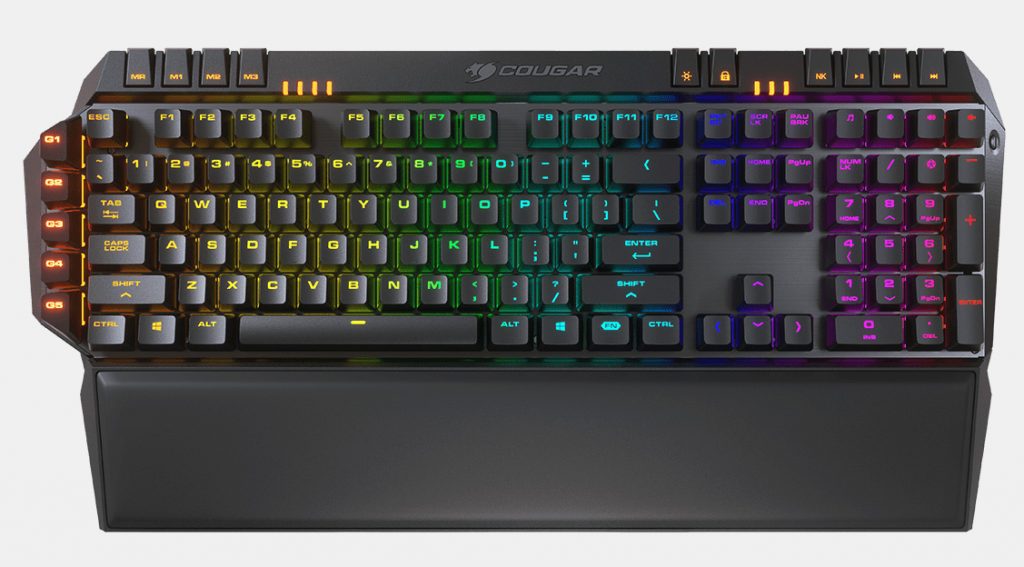
RGB used to be a selling feature, then it was bright and colourful RGB, now it’s par for the course. The RGB lighting on the 700K EVO is quite impressive. Yes, it does suffer from some light bleed as with all keyboards, but the vibrant colours come through exceptionally well where they are supposed to. Overall, I do find the RGB LED implementation rather pleasant on the keyboard.
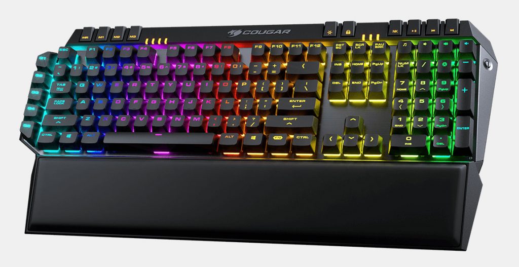
Not necessarily a design element, but one that does lend itself to the overall design is the palm rest. It’s of course smaller than the widest part of the keyboard, but this doesn’t seem to be an issue for me in the least. It’ thick cushioning along with the soft materials actually make it the most premium looking wrist rest I’ve seen to date.
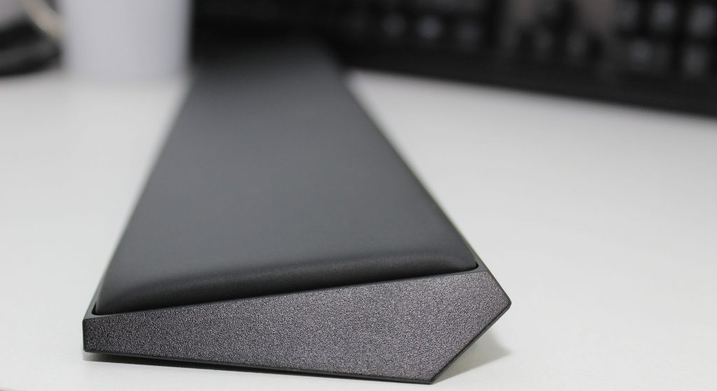
I’m a massive fan of the wrist rest on the Corsair K95 RGB Platinum, but the one on the 700K Evo is head and shoulders superior. Despite the lack of any distinct pattern or design elements, it just looks so comfortable. Even better than looking comfortable, it actually is.


